A new gastronomic experience
Company: culture4life GmbH
Products: luca app + luca Locations
Industry: services, Gastronomy, payment. B2B2C
Duration: 6 Months
Collaboration: designers, strategists, engineers, marketing.
Tools: Figma, Sketch, Abstract, Miro, Confluence, Jira, Adobe
luca offers a web and mobile application for users to conveniently pay restaurant bills. However, a high percentage of users churn after the first payment (web app) and some even fail to complete the payment, leading to dissatisfaction.
The challenge of this project for me as UX /UI Designer, has been to analyze and study the onboarding flow not only for the web app but also for the mobile app, understand the main differences in order to define the main pain points and provide a design solution considering all possible scenarios and uses of a product, while taking into account the luca goals.
Develop solutions that improve the web app onboarding ("payment") user experience and encourage more users to download the app in order to increase user retention and improve the overall experience and user engagement.
My first approach to start working on the project of enhancing the UX of the onboarding process for the web app was to understand the core functionalities and their differences, so for that, I walked through the existing web app onboarding (payment) process to understand and identify the key differences from the native app onboarding, consider how the user interacts with it at each stage, and define the benefits (for the users and the business ) and use cases of each solution. For that, I gather feedback from the Product Owner, customer support and the developer in charge of that part of the product
Understanding the differences between web and mobile app and their strengths and weaknesses helped me to make informed decisions about the selection of functions for each platform and the impact on the users and the business in order to achieve their goals and drive success.
Key takeaway
luca web app vs. native app
Native app iOS + Android
Discover • Book • Scan • Split • Tip • Pay /// use luca points
Business benefits: Increase customer retention and satisfaction, increase brand awareness and loyalty, and increase sales and revenue.
User experience: Seamless and convenient user experience, as users get all functions and content in one place. Faster payments, tailored promotions and recommendations.
User benefits: In addition to a better and smoother user experience and more extensive features users also benefit from the payback loyalty program in full: they can save luca points and redeem them as part of the payment, get sneaky restaurant offers and recommendations, make reservations and save restaurants for later.
Web app
Scan • Split • Tip • Pay /// save luca points*
Business benefits: Reach more people by offering access to any user with a cell phone and internet connection to benefit from the digital payment process.
User Experience: The payment process may take longer as it depends on the browser and internet connection which can negatively impact user engagement and retention.
User benefits: Users can take advantage of any offer available at the time of paying with luca web app (10% discount, get more luca points, etc). They can also collect luca points and request a digital payment slip by providing their email address (which serves as registration) without the need to download the mobile app.
*What users don't get: Users can save luca points but can not redeem them and use them as part of the payment.
Value proposition
luca web app
Value proposition
luca mobile app
Save time and paper with digital payment. Scan, split, tip, and pay your restaurant bill in less than ten seconds and have your digital invoice in your hand instantly.
Save time and MONEY with the LUCA APP. Scan, split, tip and pay your restaurant bill in less than ten seconds and use your collected luca points to pay for your next meal.

Since the task was to redesign the existing onboarding for the web app, my next step was to analyze the original design. Although the goal of the task was to improve the onboarding experience of the web application, it was necessary to analyze the web app and the native app holistically, keeping in mind the flow as a benefits-oriented onboarding, so I went through the onboarding of both apps from the user's POV, focusing on the web app experience to identify initial potential pain points.
I used a Miro Board to document the process, where I wrote notes about each screen and function, what didn't work, what could be improved, and what should be added. I also added notes with some integration and functionality questions that I needed to clarify later in our weekly meetings with the product owner and CTO.
1. Who is the user?
• Are they a first-time user or returning user?
• What are they trying to do?
• What are their mental models around similar services or products?
2. What does the user need to know? Info with Accuracy, Clarity, and Brevity
3. What makes the users churn during the onboarding process in the web app? Pain Points
4. What brings users to use the web app? goals
5. What encourages users to download the app? benefits
Once I understood the key differences between the web app and the mobile app, and I walked through the onboarding process, I focused on the users. Having a web and native app that already had users, I used analytics and the recording from usability testings and collaborated with customer service to collect user feedback/complaints sent to them to understand how they were using the product (focusing more on the web app) and ultimately identify the most significant pain points they might be encountering that, for example, could be causing them to abandon a certain part of the process without reaching their goal.
In this phase I extracted the insights from the data collected during the previous phases, moving from "who" and "what" users wanted/ thought/needed/did to " Why" they wanted/ thought/needed/did it. I defined the main pain points that users were facing when using the app, and after that I organized them into two main groups:
Content Issues
UX writing: a non-cohesive and consistent content experience that encompasses every user touchpoint within the product. (luca points/ loyalty program explanation/CRM)
Usability Issues
Prioritization: Important information or actions were not prioritized over secondary or less important information resulting in reduced information scent or higher interaction cost.
Speed: Some experiences (payment ) took too long to load and some interactive elements took too long to respond to ( confirm email address).
Spatial: Ineffective or suboptimal use of space (illustrations, text).
Interaction Cost: Tasks require excessive user interaction (extra steps, clicking, or scrolling) that can be simplified or removed to streamline the experience.
Feedback Missing: confusing or ineffective feedback on interactive elements (i.e., responses to user-taken actions or inactions) after payment "continues" CTA.
After identifying the main problems and users' needs, I designed a possible solution for some of the screens that solved most of the users' problems and improved the user experience, while also keeping the business goals in mind.
After sharing my designs with the product owner, designers and engineers, testing and validating them with real users, they were successfully implemented, resulting in over 30% more application downloads and customer satisfaction.

Solution:
• Using an image of people experiencing the product instead of an illustration.
• Displaying a short and clear headline about the benefits of downloading the app and adding a subtitle with additional information about the luca points.
• Designing with the minimum target device (Android & iOS) to ensure that the primary and secondary CTAs are always displayed at first glance.
• Taking into account the different browsers and the size of their search tabs when scaling the web app.
Problem:
• The illustration is not attractive, does not "showcase" the experience, and unnecessarily takes up vertical space, resulting in the following problem:
• The non-visible CTA buttons("Continue on the web" and "Download app") require scrolling, which negatively impacts the user experience. (Users therefore quit)

Solution:
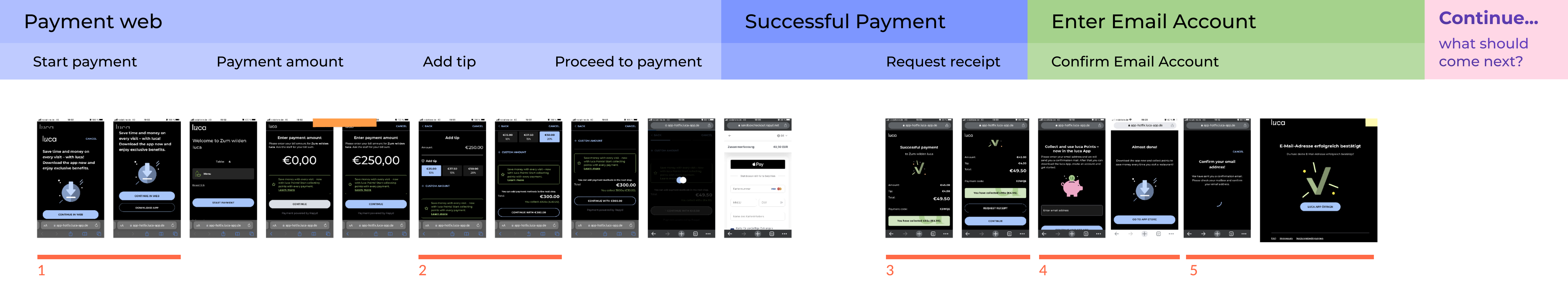
• Streamlining the payment process by merging the "Add Tip" and "Add Payment Method" functions in one screen and adding the ability to pay with Apple Pay (nearly 70% of luca users have an iPhone) or Google Pay.
• Introducing users to the native app features and benefits by displaying but disabling the "Use my luca points" feature (from the native app) and
• displaying a short and clear info banner highlighting one of the benefits of using the native app with a hyperlink to download the app
Problem:
• The payment process is long and divided into many steps
• Users do not understand the differences between the web app and the native app and their benefits, so they do not see the value of downloading the app.
• Inconsistent and unclear messaging across platforms.

Solution:
• Add the illustrations of the successful payment in a modal as an animation so that they can be cut out of the main screen and add vertical space
• Request for a receipt instead of a secondary button displayed as a link, which can also display a text confirmation of the receipt sent to the email address if the user has already confirmed the email address.
Problem:
• End of the experience?
• To see the CTA buttons requires scrolling, which negatively impacts the user experience and gives no indication if the experience is coming to an end or not.
• The “Continue” CTAs lack the added context needed to give the user peace of mind as to what's coming next.
• Hierarchy and prioritization issues: primary and secondary buttons with two different goals.

Solution:
• Display the request document in a bottom-up sheet so users know they are still on the same screen.
• After the email is sent, users can open the email account directly with a CTA, or if they haven't received the email yet, the email can be resent after a few seconds.
Problem:
• Both CTAs on the success screen enticed users to enter the email account to earn Luca points and download the app, which led to frustration as there was no clear message.
• If users have not received the email, they have to return to the browser and go back within the browser, which sometimes leads to another page, causing frustration and doubt

Solution:
• Adding a bottom-up sheet a few seconds after successful payment, with a positive headline and text explaining the redemption process, giving users a second opportunity to enter the email account when they haven't done it yet.
• A confirmation email with an informative explanation and a CTA button leading to the app store to download the app.
Problem:
• If users don't want to receive the receipt, there's no way to get them to provide their email address. A key touchpoint that leads to strategic onboarding data collection.
• Users did not understand that the email address for receiving the receipt should be the same for logging into the app in order to have the same luca points.

What should come next?
DISCOVER NEW RESTAURANTS WITH LUCA
Key takeaway
Onboarding flow


Cooming soon


